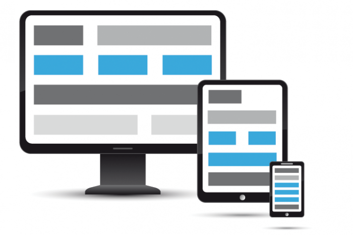
How to responsive image on Blogger- BlogSpot on Moblie, Windows phone. When you open any page on Desktop, you easy to see your image on page keep the standard site. On Mobile display, you often using img {max-with :100%} for design responsive. But may it broken and incorrect on Home page or special page..

I going to help you fix responsive size of image on Blogger- BlogSpot on Moblie, Windows phone error
1- The first you using:
img{max-width:100%}
2- Using this code before </body> or after </header>
This code help you identify the size of image only on page. Note the important after.
<b:if cond=’data:blog.pageType == "item"’><style>.entry-content span img { height:auto!important}</style></b:if>
Fix the error of image on Windows phone
Please do not insert caption on your page with x- lager size. It will be not responsive on Mobile.


