Nowadays, when most users access the internet via smartphones,mobile friendly– Mobile-friendliness – is no longer an option but a must for every website. A website that is not optimized for mobile can cause customers to leave in seconds, leading to high bounce rates, lower conversion rates, and negative SEO rankings.
So what is mobile friendly ? What factors does your website need to optimize to meet the standards? This article will analyze in detail.
Table of Contents
What is Mobile Friendly?
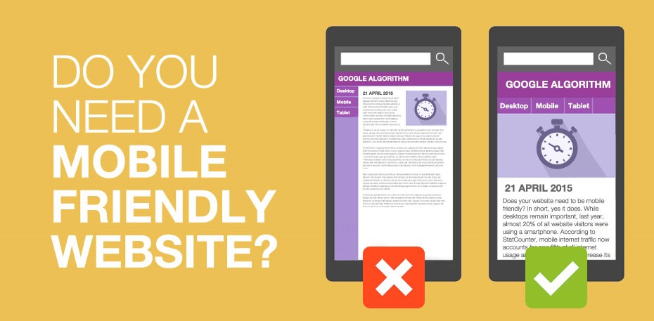
Mobile friendly is understood as the ability of a website to display and operate well on mobile devices such as smartphones and tablets. A mobile-friendly website will ensure:
-
The interface is designed to automatically scale and display harmoniously on all screen sizes.

-
Font size is large enough, easy to read, no need to zoom in or scroll horizontally.
-
The buttons and links are large enough to be easily operated with fingers.
-
Images, videos, tables, and menus are all displayed in the correct size, without distortion or broken lines.
-
Fast, smooth page loading speed on mobile networks (4G, 5G), avoiding user impatience.
In short, mobile friendliness is about ensuring the best user experience (UX) on mobile devices , making it easy for them to find information and take desired actions.
Breakpoints are pre-determined screen size points where the website interface will change its display (scale, rearrange content) to fit the width of the device. This helps ensure that users, whether viewing on a computer, tablet or phone, have the best experience without issues with layout, font size or buttons.
For example, a website might set breakpoints at common landmarks like 1200px (desktop), 992px (tablet), 768px (mobile). When the screen falls within these ranges, the interface will automatically adjust to a responsive design to optimize display.
Read more:UI UX Design – Elevating digital experiences for businesses
Why does a website need to be mobile friendly?
There are three big reasons why your website must be mobile friendly.
Mobile users are the majority
According to statistics from Google and research organizations, more than 65–75% of internet traffic now comes from smartphones. If your website only looks good and runs smoothly on computers, you are missing out on the largest group of potential customers.
A website that is not mobile-friendly causes users to constantly zoom in and out, scroll horizontally, click the wrong button, or experience display errors. As a result, they immediately leave the page and go to a competitor.
Mobile friendliness directly affects SEO rankings
Google has officially applied the mobile-first indexing policy since 2018. This means that Google prioritizes indexing and ranking based on the mobile version of the website instead of the desktop version.
If your website is not mobile friendly, there is a high chance that your Google search rankings will drop. This will not only affect your organic traffic but also reduce the effectiveness of other online marketing campaigns.
Read more:What is SEO? Summary of knowledge about Search Engine Optimization
Mobile friendly helps increase conversion rates
A mobile-friendly website will keep users on the site longer, encourage them to explore more content, and easily take actions such as filling out forms, placing orders, registering for services, calling, texting, etc.
If the mobile experience is poor, users not only leave, but also leave a bad impression of the brand, affecting the business reputation in the long term.
Read more:
Core elements of a mobile friendly website
To make your website mobile-friendly, you need to keep in mind the following factors:
-
Responsive design : The interface automatically expands and adjusts content appropriately on all types of screens.
-
Optimize page loading speed : Reduce image size, use quality hosting, optimize source code (HTML, CSS, JavaScript), use CDN.
-
Optimize font and font size : Fonts are large enough, easy to read, and not too close together.
-
Reasonable button layout : Buttons are large enough, not too close together to avoid pressing the wrong button.
-
Limit pop-ups on mobile : Pop-ups that cover the entire mobile screen are annoying and increase bounce rates.
-
Regularly check on multiple devices : Not only check on high-end iPhones or Androids, but also check on mid-range, old devices with low network speeds.
Read more:Outsourced marketing services by LBK.VN
How to check if a website is mobile friendly
You can test your website using some of the following tools and methods:
-
Google Mobile-Friendly Test: This is an official tool from Google that helps you analyze whether your website is mobile-friendly and suggests improvements.
-
Google Search Console : View the “Mobile Experience” report to spot display or usability errors.
-
Manual testing : Visit the website on your phone, observe and evaluate for yourself whether the interface is easy to see, easy to use, easy to operate or not.
Consequences if website is not mobile friendly
If your website is not mobile-friendly, you will face a series of problems:
-
High bounce rate due to users leaving immediately.
-
Reduced sales, reduced conversion rates.
-
SEO rankings drop, difficult to compete with competitors.
-
Brand image is considered unprofessional and outdated.
-
Increase advertising costs without effectiveness (if running ads).
Conclude
A mobile-friendly website not only helps improve user experience and retain customers, but is also an important factor in improving SEO, increasing conversion rates and improving business efficiency. In the current market context, optimizing for mobile friendliness should be considered a top priority when building and developing a website.
If you’re not sure if your website is mobile friendly, take a look today and make the necessary improvements. Investing in the mobile user experience is investing in the long-term growth of your business.